
Introduction
Parents often meet your pediatric practice online before they ever meet your providers.
Your homepage shapes that first impression. It tells parents whether your practice feels welcoming, whether it’s easy to book an appointment, and whether they can trust you with their child’s care.
That’s the premise of this audit. Not the booking system after three clicks. Not what’s waiting behind a patient portal login. Just the homepage, exactly what a parent sees, reads, and can act on before they click anywhere else.
We reviewed the homepages of 20 pediatric practices and scored each one purely on what’s visible or clearly linked from the homepage. Nothing buried three clicks deep. If a parent wouldn’t see it without digging, it didn’t count.
Here’s what we found, including a few things that surprised us.
What a Good Pediatric Homepage Must Do
Think of the homepage as the practice’s digital front desk. Before a parent ever talks to a receptionist, the homepage has already done (or skipped) a handful of essential jobs:
- A clear sense of who it serves. Newborns through teens, or a specific age range, obvious in seconds, not inferred from a logo.
- A visible new-patient signal. Whether the practice is accepting new patients, and which insurance plans it takes, shapes whether a parent keeps reading or bounces.
- An unambiguous way to book. Doesn’t have to be online booking. It has to be clear, not buried in a menu or hidden behind vague wording.
- Sick-visit and urgent guidance up front. What to do if a kid is sick today, and where that differs from a true emergency, belongs near the top, not on a policies page three clicks in.
- Hours and contact info without a click. Phone number, hours, an AI chatbot for quick questions, and after-hours or nurse-line guidance should be sitting right there, not one page away.
- A tone that reads as safe and child-focused. Parents are evaluating who they trust with their kid, not just a business. The homepage should feel like it, not like a generic clinic template.
- Real proof, not just a slogan. A bio, a review, a credential, something specific that isn’t just a tagline and a stock photo.
- A visible self-service signal. A link to a patient portal, online forms, vaccine records, patient communication tools, or other resources tells parents self-service is available, even before they click.
- A path for virtual or telehealth care, if it exists. Parents increasingly check for this before calling, and it shouldn’t be a surprise found only after booking.
- More than one way to reach the practice. Not every parent wants to call. Offering options such as HIPAA-compliant texting, an AI medical receptionist, live chat, or a secure contact form shows that the practice is accessible and responsive to different communication preferences.
How We Ran This Audit
We evaluated each pediatric practice website homepage using the same criteria to understand how well it helps parents find information, build trust, and take the next step. This audit focuses only on what a parent can see, understand, and access from the homepage. We did not evaluate booking flows, patient portals, or any functionality beyond what was visible or clearly linked on the homepage.
Each homepage was assessed across six factors:
- First Impression: Is it immediately clear who the practice serves and what parents should do next?
- Booking Clarity: Can parents easily find online appointment scheduling or a way to request an appointment from the homepage?
- Access & Contact: Are the phone number, hours, location, and other key contact details easy to find?
- Self-Service Visibility: Are resources like the patient portal, digital medical forms, or bill pay clearly visible or linked?
- Trust Signals: Does the homepage establish credibility through provider information, patient reviews, awards, visible security and privacy assurances (such as HIPAA compliance), or other trust builders?
- Mobile-Friendly: Does the homepage provide a smooth experience on mobile devices?
To make the scorecard easy to scan, we used a simple three-point system:
- ✓ Meets expectations
- – Partially meets expectations
- ✗ Doesn’t meet expectations
Based on these findings, each homepage also received an Overall Verdict reflecting its overall performance across all six evaluation criteria.
The Scorecard: How 20 Pediatric Websites Stacked Up
| Pediatric Practice | Overall Verdict | First Impression | Booking Clarity | Access & Contact | Self-Service Visibility | Trust Signals | Mobile Friendly |
|---|---|---|---|---|---|---|---|
| South Lake Pediatrics | Excellent | ✓ | ✓ | ✓ | ✓ | ✓ | ✓ |
| Sunshine Pediatrics | Excellent | ✓ | ✓ | ✓ | ✓ | ✓ | ✓ |
| Agave Pediatrics | Excellent | ✓ | ✓ | ✓ | ✓ | ✓ | ✓ |
| PedsNY | Excellent | ✓ | ✓ | ✓ | ✓ | ✓ | ✓ |
| Boston Children’s Hospital | Excellent | ✓ | ✓ | ✓ | ✓ | ✓ | ✓ |
| Kids First Pediatrics | Excellent | ✓ | ✓ | ✓ | ✓ | ✓ | ✓ |
| Cincinnati Children’s | Excellent | ✓ | ✓ | ✓ | ✓ | ✓ | ✓ |
| Capital Area Pediatrics | Excellent | ✓ | ✓ | ✓ | ✓ | – | ✓ |
| Potomac Pediatrics | Excellent | ✓ | ✓ | ✓ | ✓ | – | ✓ |
| Akron Children’s Pediatrics | Excellent | ✓ | ✓ | ✓ | ✓ | – | ✓ |
| Pleasant Pediatrics | Adequate | ✓ | ✓ | ✓ | ✓ | ✗ | ✓ |
| Children’s Medical Group | Adequate | ✓ | ✓ | ✓ | ✓ | ✗ | ✓ |
| AdventHealth for Children | Adequate | ✓ | – | ✓ | – | ✓ | ✓ |
| Lawrence Pediatrics | Adequate | – | – | ✓ | ✓ | ✗ | ✓ |
| ABC Pediatrics | Adequate | – | ✓ | ✓ | – | ✗ | – |
| Pediatrics East | Adequate | – | ✓ | ✓ | ✓ | ✗ | ✓ |
| Austin Regional Clinic | Adequate | – | ✓ | ✓ | ✓ | ✗ | ✓ |
| The Pediatric Center | Needs work | – | – | – | – | ✗ | – |
| Southside Pediatrics | Needs work | – | – | – | – | ✗ | – |
| RM Pediatrics | Needs work | ✗ | ✗ | – | – | ✗ | ✗ |
What’s Broken: The 5 Most Common Failures
Across all 20 homepages, a handful of issues consistently stood out.
Trust Signals Are The Weakest Factor, By A Wide Margin
Every other factor cleared 65% or higher. Trust Signals sat at 40%, with 9 of 20 homepages showing zero credibility content: no bios, no reviews, no awards.
A Portal Link Isn’t A Self-Service Invitation
15 of the 20 homepages link to a patient portal or resources. On five of them, the link is tucked away in the navigation menu, making it easy for parents to miss
Clutter And Dated Design Cost Trust Before A Parent Reads A Word
The lowest-scoring homepages didn’t just miss features; they looked confusing or outdated at first glance. RM Pediatrics still runs without HTTPS, which flags as insecure before any content even loads.
Booking Is Often Clear, But Rarely Reassuring
15 of 20 homepages have an unambiguous booking path, a live tool, or a clearly stated phone number. Solid number. But a few (PedsNY, Agave) show a booking button with no hint of what happens next: live slots? A request? New patients welcome?
Even The Best Homepages Treat Trust As An Afterthought
Of the 10 Excellent-rated homepages, only 7 have a full ✓ on Trust Signals. The other 3 (Capital Area, Potomac, Akron Children’s) got there on partial trust content: a few dated reviews, a vague outreach mention, reputation without specifics.
Who Got It Right? The Best-Performing Websites We Reviewed
Here are the homepages that impressed us most.
🏅 Best Overall — South Lake Pediatrics
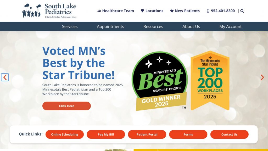
The only homepage that leads with a real award instead of a slogan: “Voted MN’s Best by the Star Tribune,” badge and all, above the fold. It’s backed by a clean quick-links bar too: Online Scheduling, Patient Portal, Pay My Bill, Forms, Contact Us. Credibility and function share the same screen, which is why this is the one homepage with a full ✓ across every factor.
🏅 Best Patient Engagement — Boston Children’s Hospital
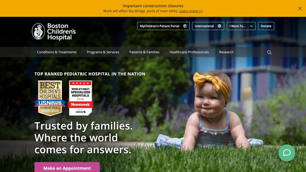
The patient portal isn’t buried in a footer. It’s a labeled button right at the top. National rankings from U.S. News and Newsweek reinforce trust without eating up space, and “Make an Appointment” stays the one action a parent can’t miss. Scale doesn’t get in the way of simplicity here.
🏅 Best Access — Agave Pediatrics
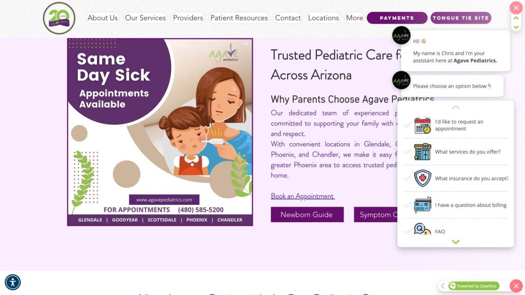
A same-day sick visit banner up top, a direct phone number impossible to miss, and a chatbot that opens immediately with the questions parents actually ask: request an appointment, check insurance, ask about billing. Click, call, or type a question; the homepage meets you there.
🏅 Best Contact Experience — PedsNY
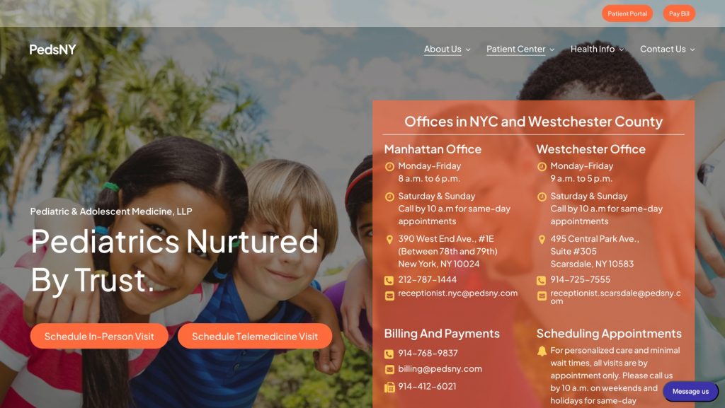
Every office gets its own block: phone number, email, and hours laid out side by side, no digging required. A parent in Manhattan and a parent in Westchester each see exactly what applies to them. Separate buttons for in-person and telemedicine visits make the next step just as clear.
🏅 Best Timely Communication — Sunshine Pediatrics
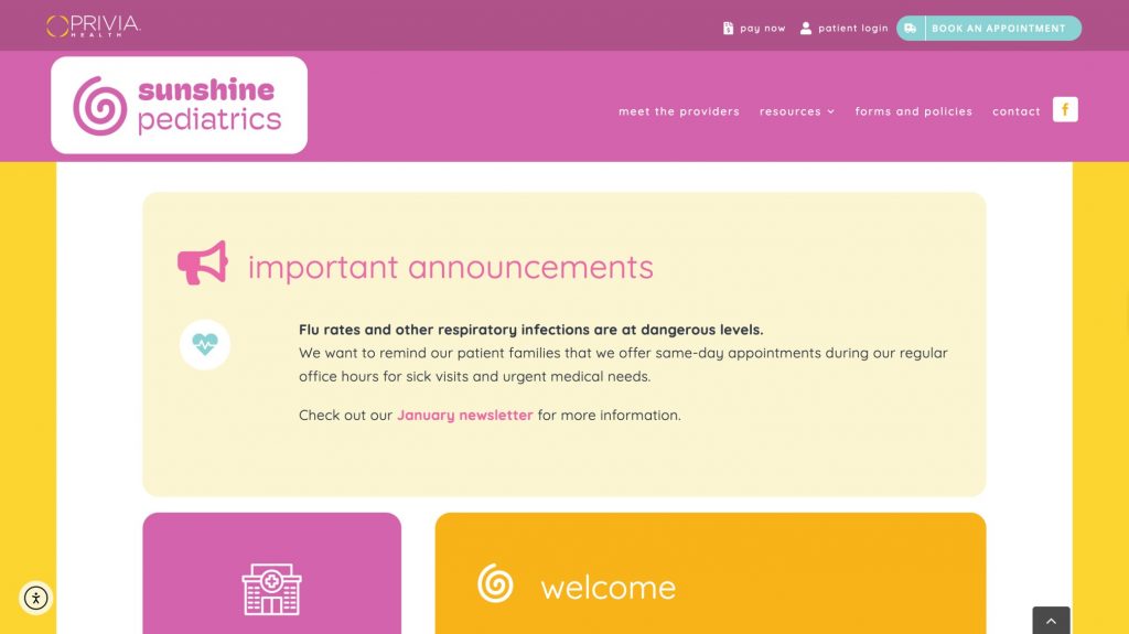
Before anything else loads, a live, dated announcement: flu rates are up, and same-day sick visits are available now. It reads like the practice is paying attention to this week, not running on copy from last year. That one detail builds more trust than a generic welcome message ever could.
Your Pediatric Homepage Checklist
Wondering if your pediatric practice website homepage is helping parents take the next step? Use this checklist to identify what’s working well and where there’s room for improvement.
FAQs
A strong homepage should clearly state who you treat, whether you’re accepting new patients, how to book an appointment, office hours, contact information, same-day or sick-visit guidance, links to patient resources, and visible trust signals like provider bios or patient reviews.
A good pediatric website helps parents quickly find the information they need and confidently take the next step. Clear navigation, simple booking, and visible trust signals matter more than flashy design.
Make the booking process obvious and explain what happens next. Whether parents can book instantly or submit a request, set clear expectations and place your booking option prominently on the homepage.
Yes, if possible. Online scheduling makes it easier for parents to book appointments, but if you don’t offer it, your preferred booking method should still be clear and easy to find.
The strongest trust signals include provider bios, patient reviews, awards, certifications, professional affiliations, and other specific proof of your practice’s credibility.
Very important. Your homepage should load quickly, display correctly on all screen sizes, and make it easy for parents to find key information and book appointments from a mobile device.
Review your homepage at least once a year and update it whenever your providers, hours, insurance plans, services, or booking process change. Keep reviews, awards, and other trust content current as well.


 4.9 (400+
reviews)
4.9 (400+
reviews)